Redesigning T-Mobile's Online Purchase Experience
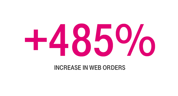
In 2016 I was involved in a massive redesign of T-mobile's website. At that time it took an average of 84 clicks (not a typo) to check out on T-Mobile's website. I helped redesign the site to simplify the experience.
The redesign began with the browse page, which was the typical starting point for users hoping to make a purchase from the site. We introduced two levels of filtering so that users can quickly find what they are shopping for. The first level of filtering consists of tabs that filter products by the three main shopping categories: phones, tablets and devices, and accessories. Prior to this, users had to navigate to separate pages through the global nav in order to shop between the three categories.
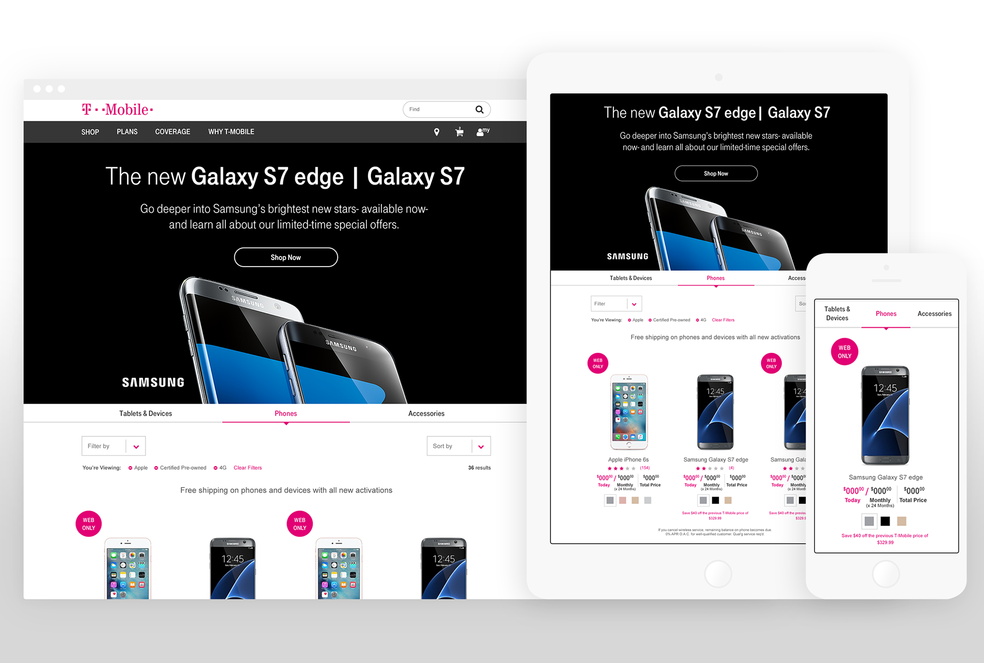
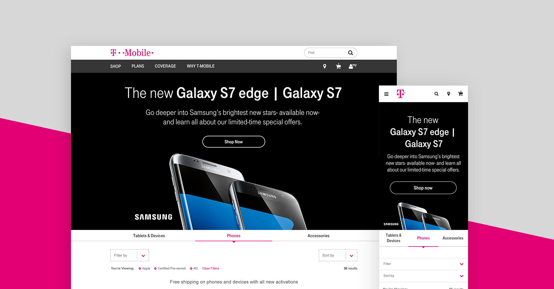
Browse Page Filters
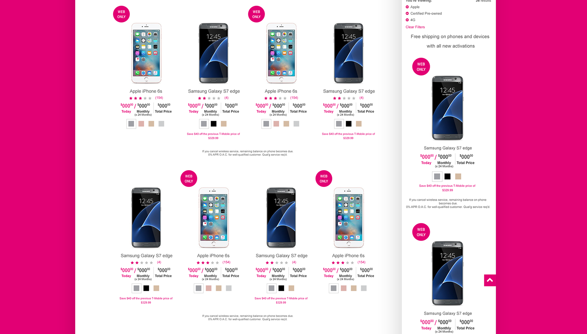
The secondary set of filters on the browse page posed a challenge due to the large amount of unique categories. On desktop I introduced an exposed filter menu so that users can select multiple filters from different categories at once, as opposed to the previous design which used four to six separate dropdowns. On mobile these filter categories were expanded out in an accordion. The filter list for accessories was so extensive that we had to add in an additional layer of filtering. We did that with swipe-able tabs above the filter dropdown menu.